Where Creativity Meets Nature

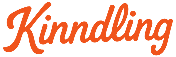
The Name
Kinndling comes from the word “kindling,” the small sticks used too start a fire. It represents how even the smallest spark can grow into something greater. Creativity often begins the same way: with a humble idea that fuels a larger journey.

The Logo
The Kinndling logo is a letter “K” made from three sticks. They represent the kindling itself, layered to start a fire. Together they also form the shape of a spark, a symbol of how every creative journey begins.
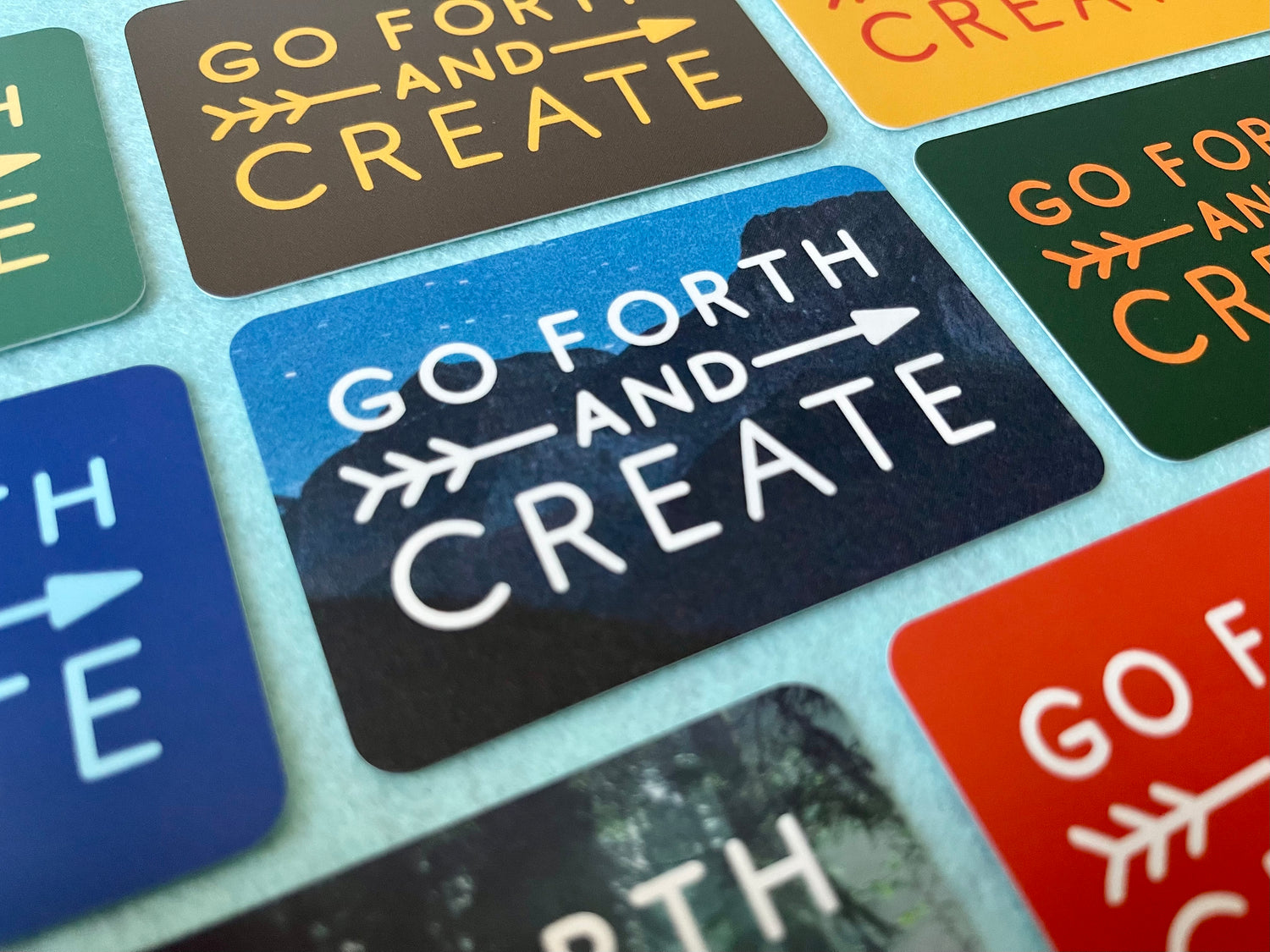
The Tagline
“Go Forth & Create” is more than a tagline. It is a call to action. A reminder to take what inspires you and bring it into the world in your own way.

The Number 17
The number 17 marks the origin of Kinndling. In 2017 the first sparks were captured, and the journey has been evolving ever since. It is a reminder that every path begins with a small step and can grow in unexpected ways. Kinndling today looks very different from where it started, yet the heart of it has always stayed the same.


